For my next project I wanted something more complicated. As the new Dune film is out, and I’m a total Dune fan, I thought a map of Arrakis would be pretty cool.
The Map
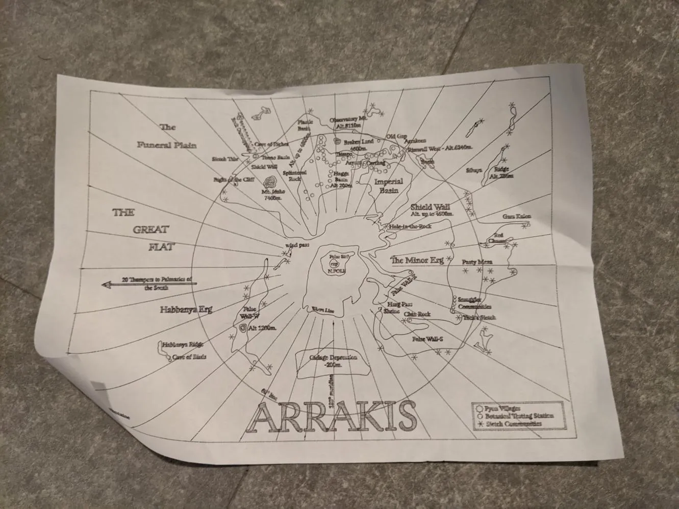
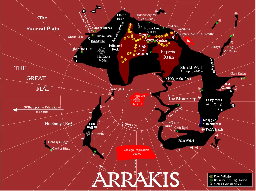
Unlike Mars, there’s no geo data for Arrakis as (a) it doesn’t exist, and (b) no one’s done it yet :D. But, there is a polar projection map! I found this Reddit thread where someone has taken a bitmap scan from somewhere and drawn a vector version. Here’s the original bitmap.
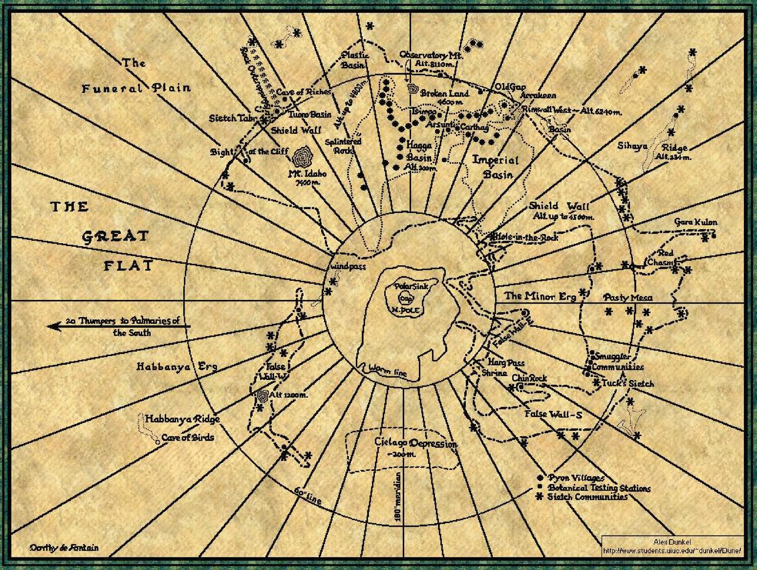
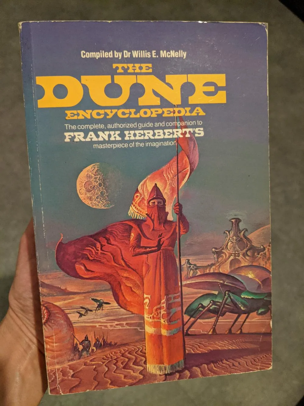
At the bottom left, there’s the original author’s name, Dorothy de Fontaine. Interestingly, it is spelt incorrectly, which implies this bitmap may have been reprocessed, or else an error in the original publication. I’d wondered if this came from The Dune Encyclopedia, but I consulted my copy, and there was no map:
I did do some quick research into Dorothy de Fontaine: it seems she was a cartographer in New Canaan, Connecticut. I wasn’t able to find much else besides a death notice, but I bet she would have been interesting to speak to.
Anyway, I have vector map data, lets investigate it!
Problems with the vector map
Hmm, the main problem is it has been clearly machine converted from a bitmap. Instead of solid (or dashed lines), you end up with the following transformation:
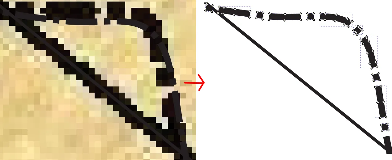
As you can see the dashed lines in the Illustrator file aren’t actually lines! they’re separate rectangular blocks, useless for my purposes. I spent a few hours trying to make Inkscape stitch them together again with absolutely no luck: I ended up just redrawing most of it myself one evening. My technique is to draw quickly it using the freehand tool, use the simplify tool, then adjust each line segment with the node tool to make it match as closely as I can.
Once I had sorted that out, I wanted a better font than in the Illustrator file:
I tried running it through FontSquirrel again, with no luck… which is kinda obvious in retrospect since its clearly handwritten.
So, this time, I used identifont: rather than uploading an image, it asks you questions about the font to find one that is close. Eventually, I found that Lexon Gothic was pretty close: not identical, but close enough to keep me happy.
There were a couple of spelling mistakes in the Illustrator file, as well as a few cases of misapplied symbology (eg, I doubt you’d have a Pyon village outside the Shield Wall: hmm, did I mention I was a Dune fan? :D ).
At this point I did a die cutter test with a cheap ballpoint pen:
Interpreting the Map
Next task was to interpret the map: there’s clearly different elevations involved. In the end, I found four distinct layers:
- The Desert.
- The Safety of Rock.
- The Desert within the Shield wall.
- There are a couple of depressions within the main Desert as well.
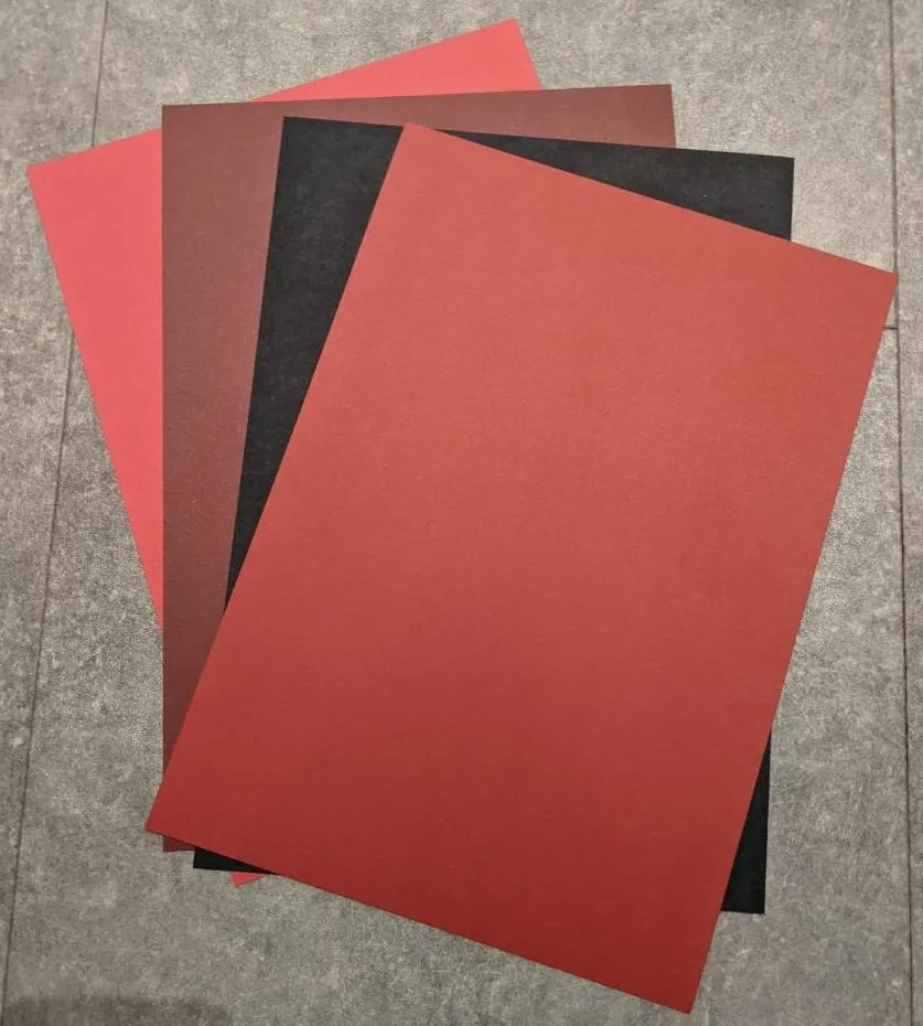
Choosing the Colours
I split my new vector file up into layers so I could the colours of layers easily and started playing around (and checking what card I had available). I eventually ended up with a selection of reds and blacks as follows:
Preparing to Cut
This is much more complicated than anything I’d tried before! I have four separate layers of card, all different colours, with designs cut into them, and also designs drawn on them in silver pen. I reorganised my Inkscape file layers and split things up so I could easily draw/cut the cards:
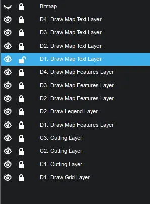
The layers starting with D are Drawing layers, those starting with C are Cutting layers. I use multiple Drawing layers at once; maintaining the separation between different things being drawn (even if on the same physical layer) really helps editing!
There is some duplication between layers, especially for text. Text commonly appears across multiple physical layers, so it needs drawn on all of them: parts of the same string from different layers will show through the cuts.
Drawing/Cutting Process
- I put the silver pen tool into the die cutter along with the card for layer 1 on the cutting mat.
- I display all layers starting with D1 and draw them with silver pen.
- I hide them and display the C1 layer.
- Then I remember to swap the pen for the cutting tool (grrr!)
- I cut the card.
- Carefully remove it from the cutting mat and stick the card for layer 2 onto it.
- Repeat the process for layers 2,3 and 4 (there’s no cutting step for layer 4).
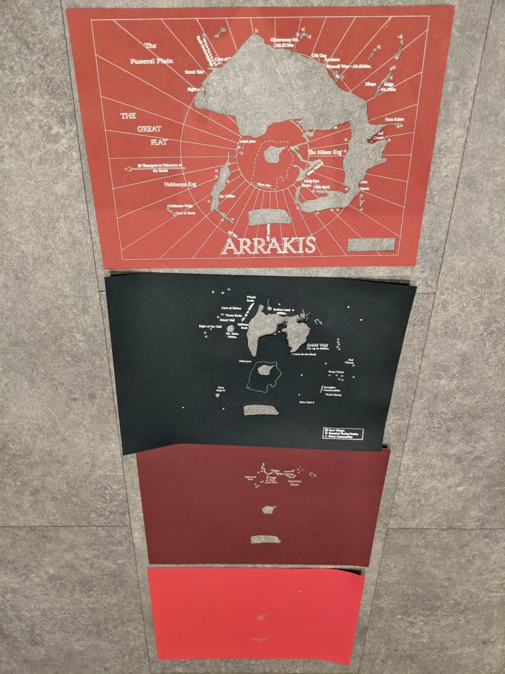
Once I’d finished (with a few accidents with the cutting tool), I had these physical layers:
Final Result
Putting it all together gives the final result:
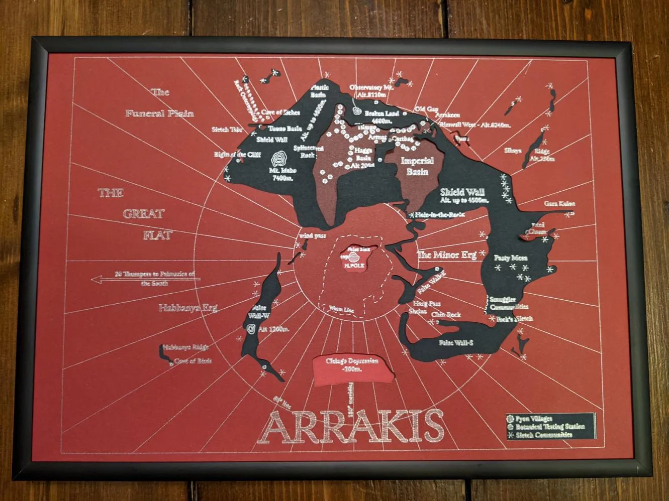
I’m extremely happy with it! In fact, its really strongly reminding me of the colour scheme on ancient Grecian vases:
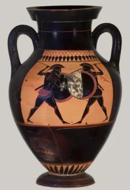
That is a total accident on my part, but its quite relevant given the Greek myths inspiring Dune.
Oh, here’s a pic of the vector design in Inkscape:
2 Comments
Paul Atreides ·
Chris Hansen ·
I've been doing some research on the original map of Arrakis. I wanted to point out that I have found two main spelling discrepancies on the many and various maps through the years including possibly yours. Is this definitive? Hardly. I'm just going by the evidence I have discovered online between these differences, along with vague memory.
Tuck's Seitch seems to be considered Tuek's Seitch named after Esmar Tuek the smuggler. Looking up Tuck's Seitch in the Dune Wiki takes you to the Tuek's Seitch listing, there is no listing for Tuck's Seitch.
I can only say that I seem to remember from way back in the early 70's reading a paperback edition of the first US printing, and to this day I seem to remember on the map in that book having Tuek's Seitch rather than Tuck's Seitch, and that's going on an old memory of my realization that it was connected to the smuggler Esmar Tuek from the dinner party who was later murdered by Dr. Yueh.
And second, that Cave of Riches should be Cave of Ridges, a rest stop for Fremen patrols. It was here that Jamis challenged Paul to a duel to the death. This is also how this location is listed in the Dune Wiki.
It does seem that the first map from some first edition was actually made a few years after the dune serial series and the UK edition of the book back in 1965. Possibly the map was in the US hardcover first edition? It also seems that Dorothy de Fontaine was likely working off notes from Frank Herbert and perhaps misread things? Hard to say at this distance. Like you, I would love to have a conversation with her regarding her map. Or with Frank Herbert about the map for that matter.
Sadly, both options are lost to us in time.
Speaking of time, I realize that I'm rather late on these observations, almost 4 years late. But I must say that I do like what you did with the map. The black on red is striking, and you did get the font looking correct. I only wanted to point out these spelling discrepancies for your consideration. But in any case, you overall did a fine job on this map, and thanks for sharing your work.